12TH MARCH
Dan Mumford is an illustrator based in London who has had clients among Disney, Sony, CBS, and Iron Maiden.

http://www.dan-mumford.com/about/
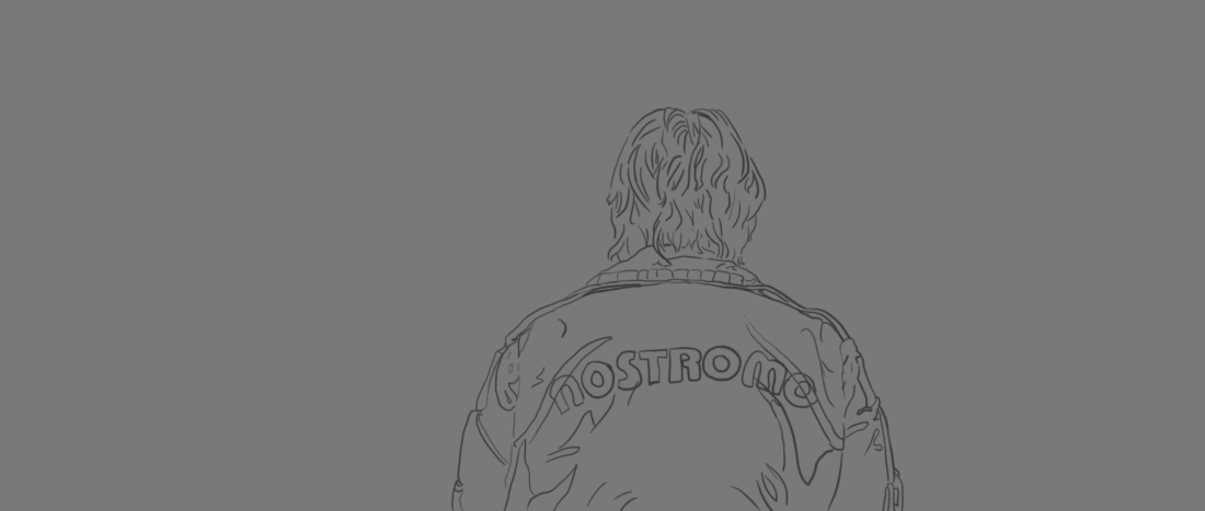
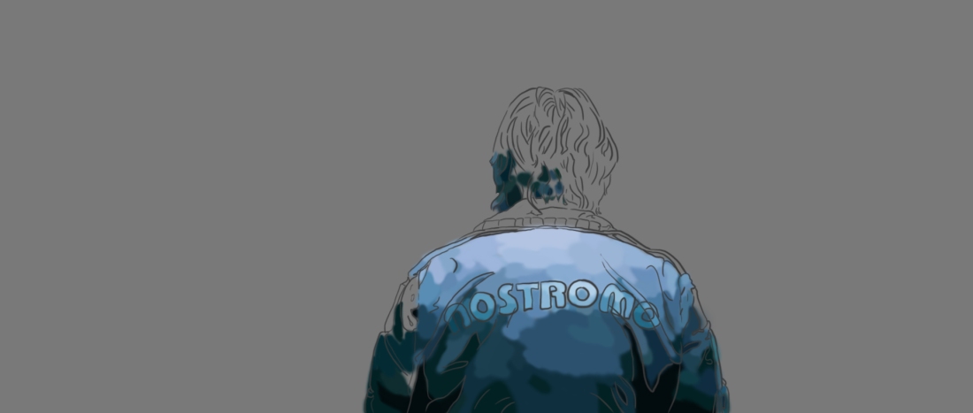
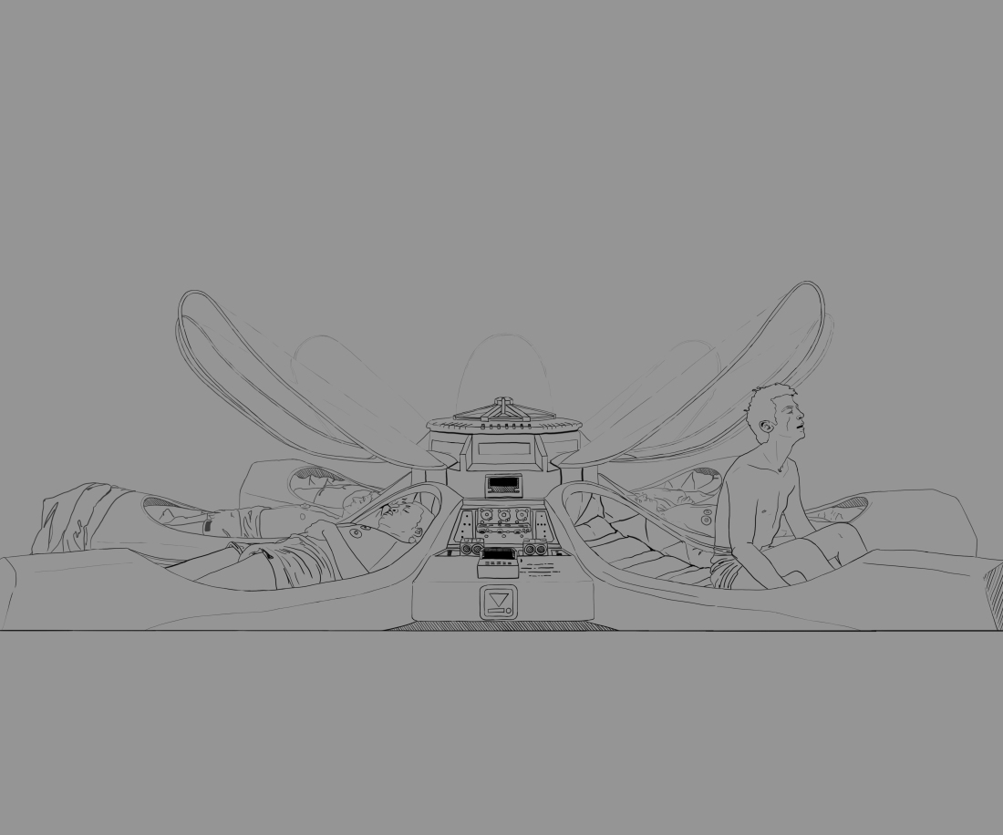
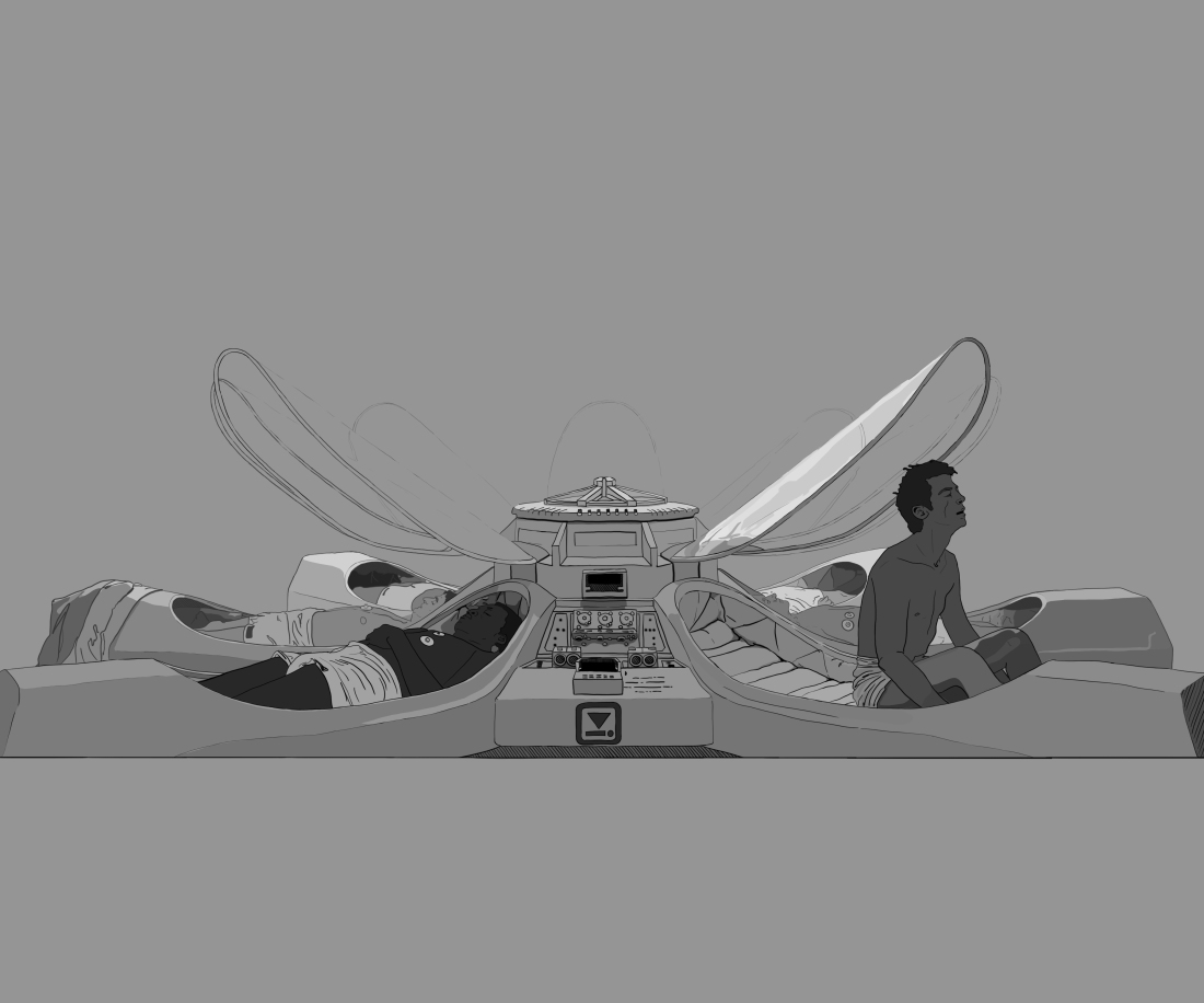
2001: A Space Odyssey Illustration

Characteristic of Dan Mumford’s works is the use of colour. Often he will use harmonious and contrasting colours for any one piece, along with a lot of blackwork. The colour schemes are simple but highly effective. The frequent use of only harmonious colours gives these pieces a strong emotional atmosphere, or a strong sense of time and place.
The use of solid black gives many of his works a great amount of contrast. Many of his works, including this one, have the largest amount of black towards the bottom of the frame, decreasing as your eye moves up to the top of the piece. Naturally your gaze is drawn to the lightest part of the image, cleverly directing your towards the eye in the sky.
The composition used has the focus on the sun which imitates Hal’s ‘eye’. Hal is the AI within the film, and the glowing red ‘eye’ is the most powerful and recognisable iconography within the film. He is portrayed as a sort of all knowing, all seeing character within the film, which makes the use of it in this image so ingenious. His role as the sort of big brother eye over the crew is perfectly communicated in this composition, placed in the sky above all of the apes on the ground.
This eye is framed by the U shaped rock formations, which follow the circular flow created by the featured eye. This flow stands in contrast to the straight, horizontal lines in the sky. I like that the placement of these lines is used solely in the sky for the reason that the area of sky is sort of sectioned off for the character of Hal. As a sentient AI, the thought process we are shown from him is a logical one, communicated by the use of straight lines and perfect circles, with even line weight.
This logical characterisation is displayed in variance to the more emotional outlook of the human characters, represented in the foreground by the apes. The foreground employs chaotic, uneven lines within the rocks and ground, and the figures sit in irregular groups leading the viewer’s eye towards the out of place monolith. This simple change in use of line manages to perfectly capture the characterisation of the characters in the film.
From studying this work, I want to move forward thinking about colour choice in film, and the reason for these choices; I want to think about the use of blackwork to create great contrast within any illustrations I will create, and again think about the use of composition for illustrations.